Malaysia Airlines
(Web & Native App)
Branding
Design System
Booking System
Web Check-in


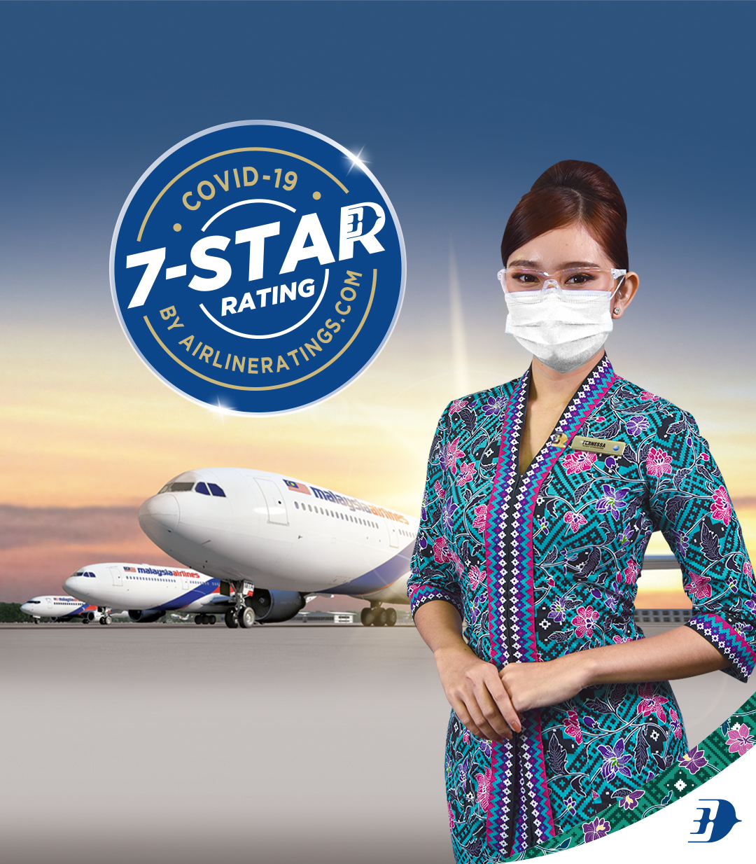
Travel safely with
us


Case Study: Malaysia Airlines Website Redesign
Requirement
Redesign Malaysia Airlines’ primary website to enhance user experience, boost performance, update to global accessibility standards, and better compete in a crowded market during a platform migration.
- Pain Points
- Cluttered Navigation & Responsiveness: Users struggled with finding key functions across devices.
- Low Conversion Rates: High drop-off in the booking funnel and frequent bounce to microsites.
- Brand Misalignment: Visual identity and messaging no longer reflected the airline’s modern vision.
- Poor Site Performance: Slow load times degraded engagement and SEO.
UX/UI Strategy
- Stakeholder & Team Workshops:
– Aligned on redesign goals, market trends, and user pain points.
– Defined hypotheses around personalization, real-time info, and contactless features. - Research & Analysis:
– Mapped industry landscape (health-safety, “bleisure” travel), competitor benchmarks, and customer journey pain points.
– Created proto-personas and journey maps to surface key task flows (booking, check-in). - Iterative Design Sprints:
– Developed IA, user flows, and wireframes; validated via usability testing and RAG-style workshops.
– Progressed to high-fidelity mockups, ensuring WCAG compliance and mobile-first responsiveness. - Design System & Accessibility:
– Established reusable components (buttons, forms, modals) with 4.5:1 contrast, focus management, and keyboard navigation.
– Integrated vibrant yet brand-cohesive palette and iconography for consistency.
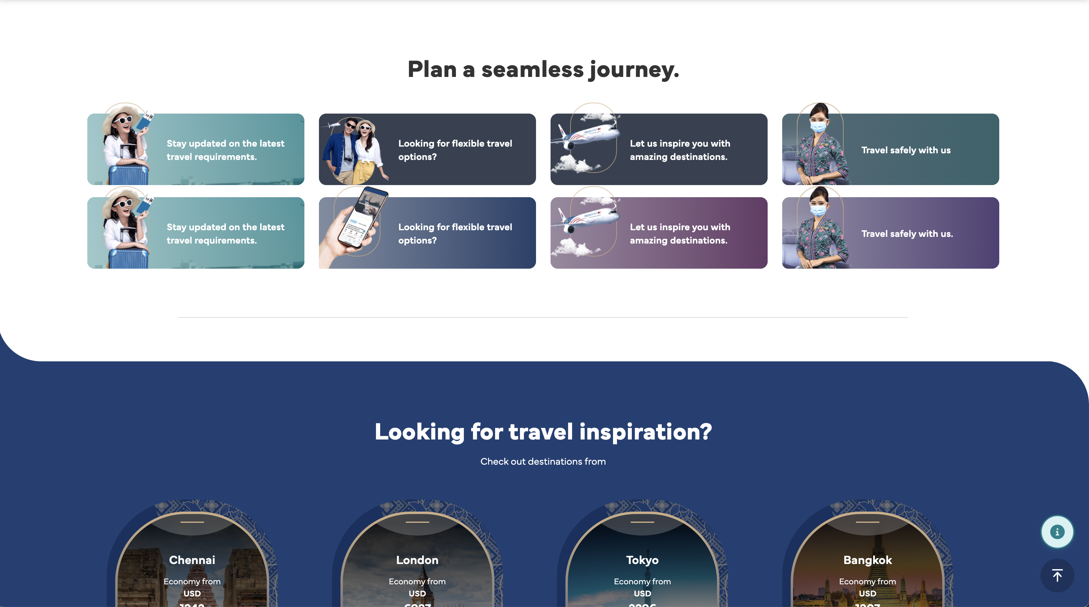
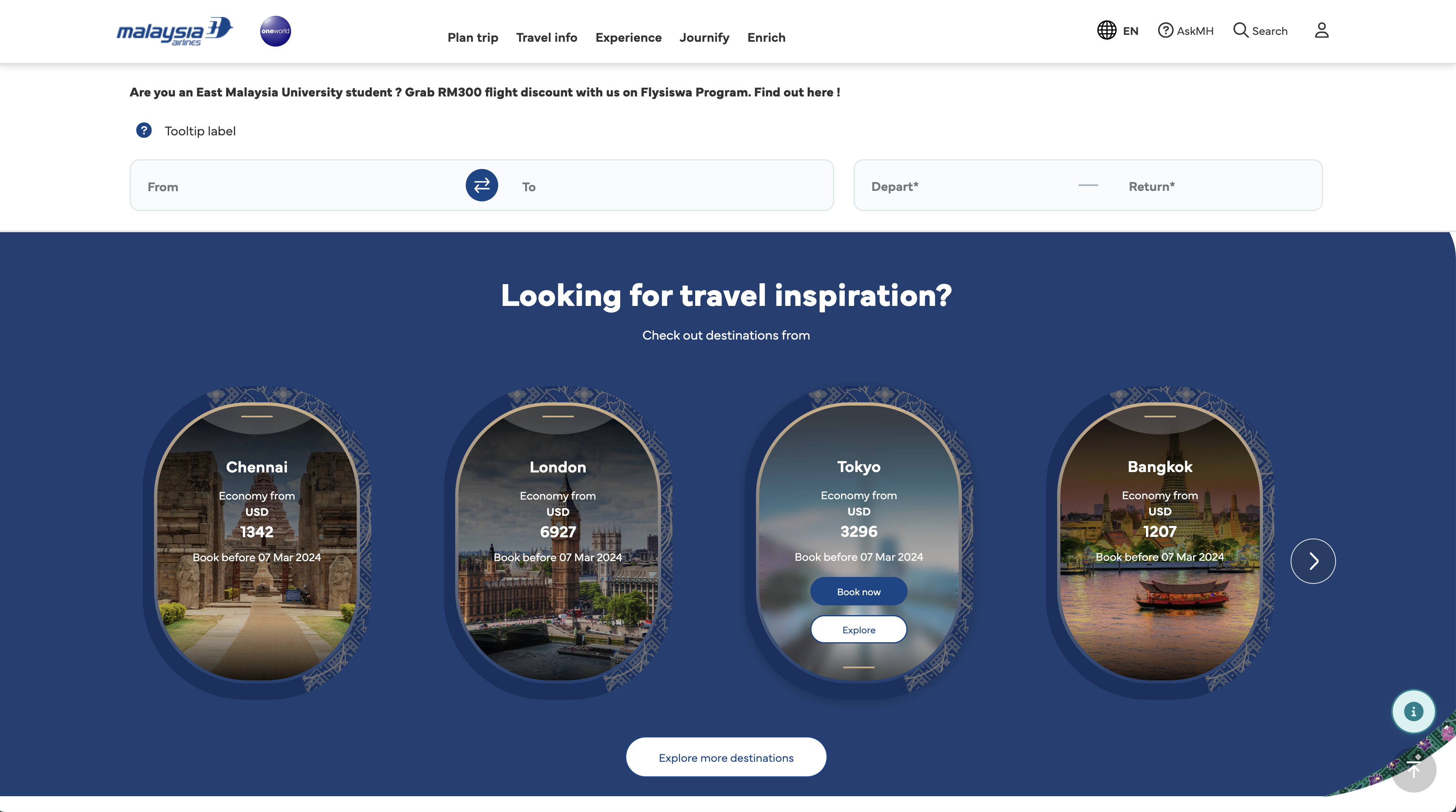
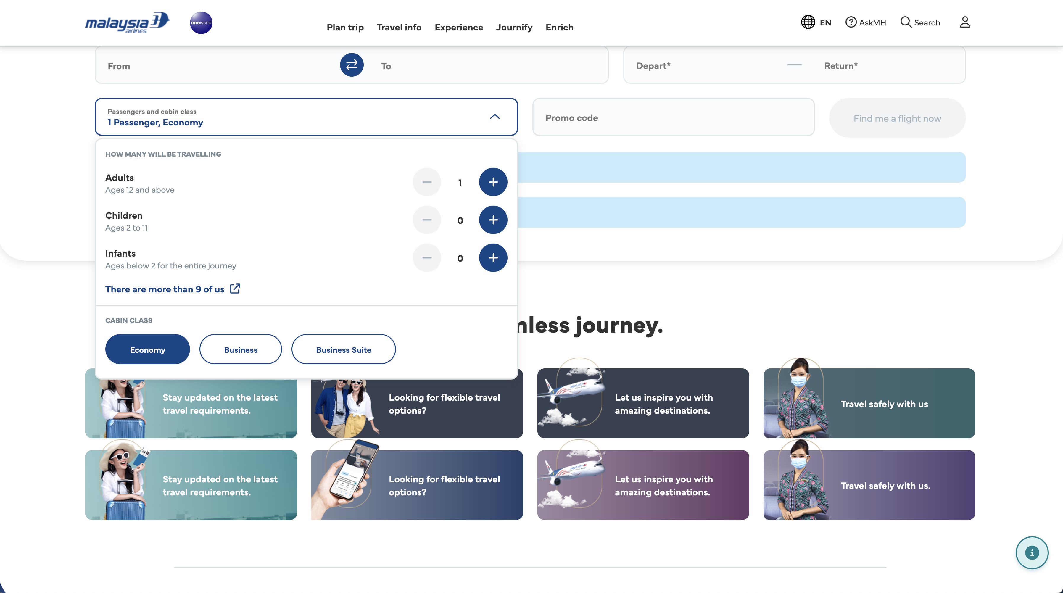
Solution
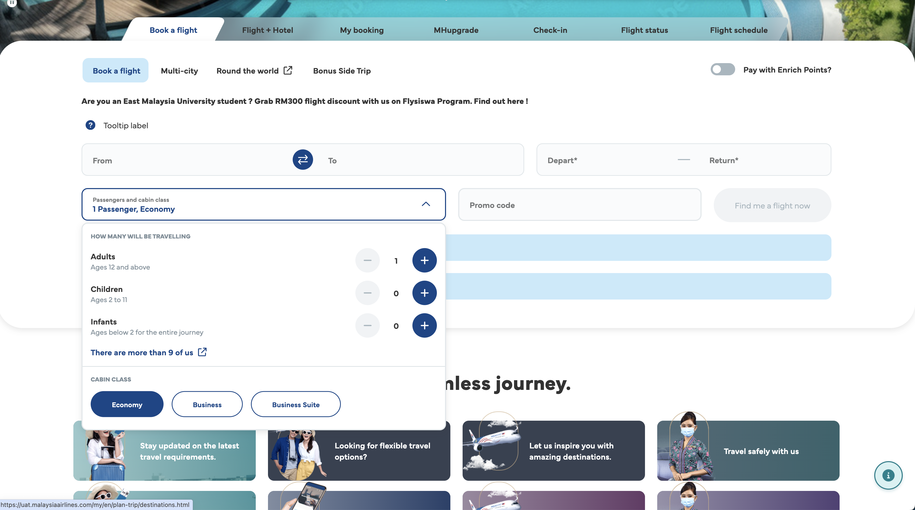
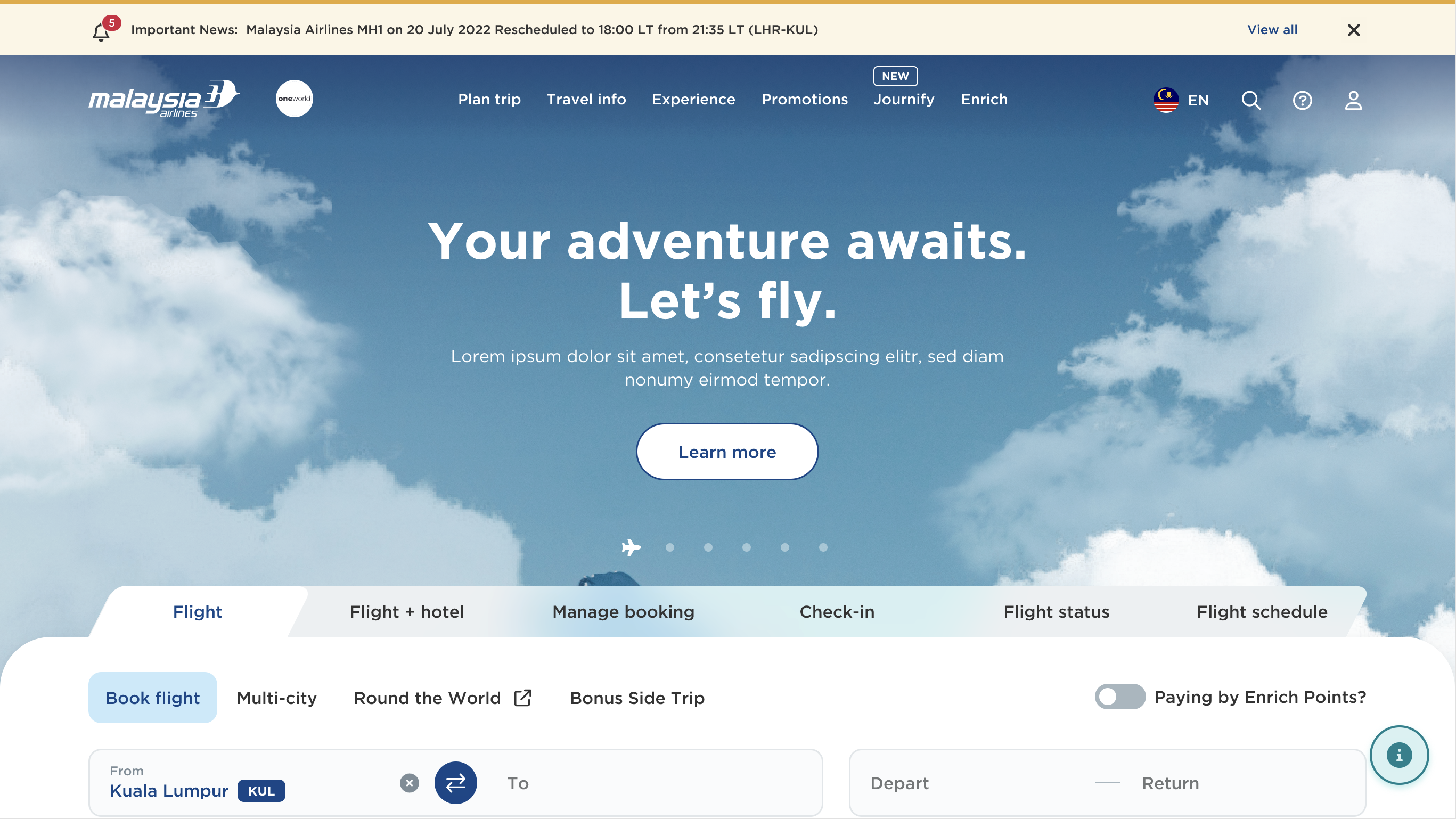
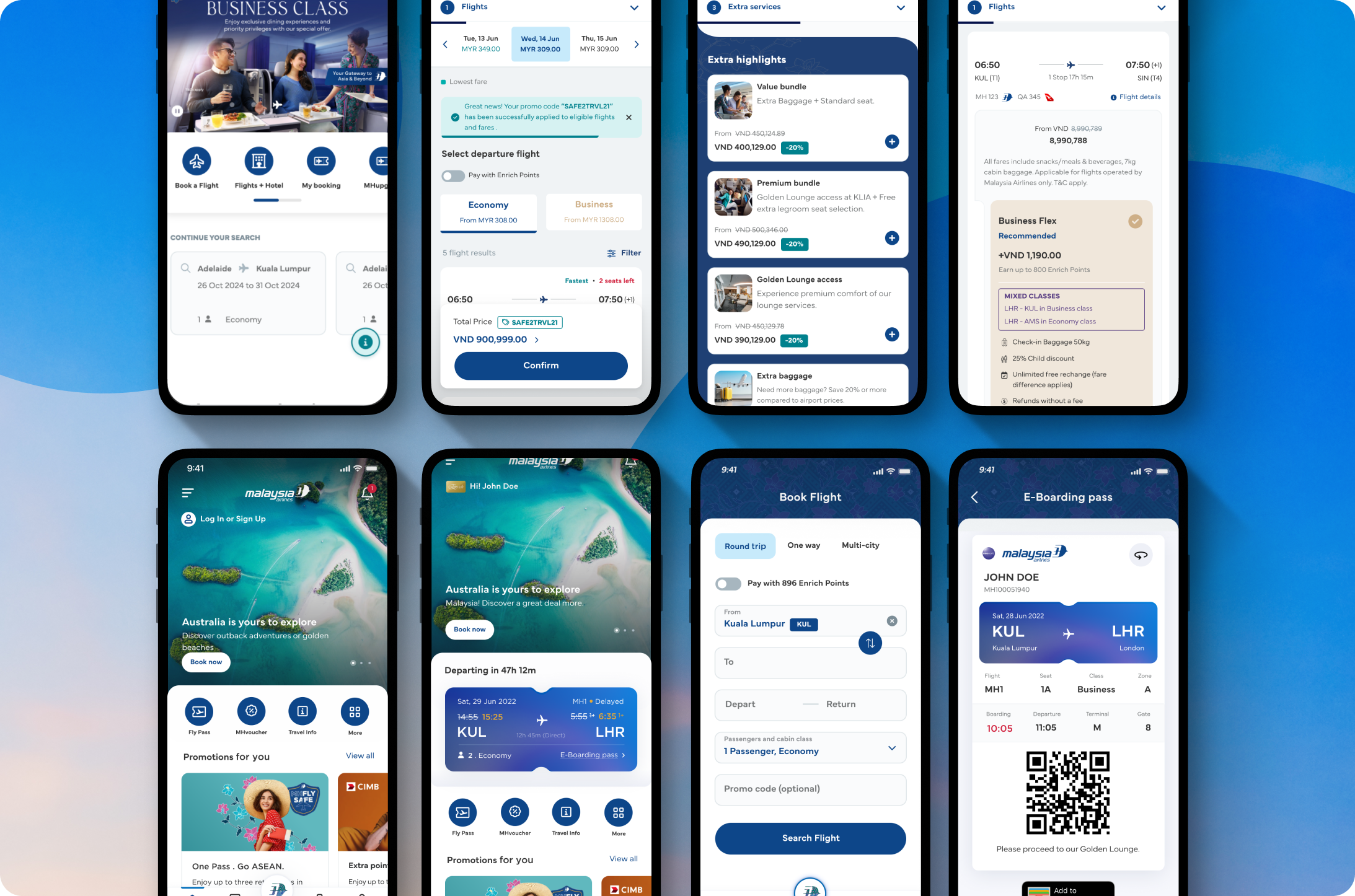
- Streamlined Booking Flow: Dynamic calendar, flexible fare options, and progress indicators reduced cognitive load.
- Personalized Dashboards: Saved preferences, loyalty status, and curated offers increased relevance.
- Interactive Route Map: Visual exploration of destinations boosted engagement.
- Accessibility Features: Adjustable text sizes, high-contrast mode, screen-reader support, and voice search.
Outcome & Impact
- +50% Website Traffic within three months post-launch.
- Higher Conversion Rates: Booking funnel drop-offs decreased by 30%.
- Improved User Satisfaction: Positive feedback rose by 40% in post-launch surveys.
- Performance Gains: Page load times halved, meeting modern web benchmarks.
This redesign balanced strategic business goals with deep user empathy, delivering a faster, more accessible, and emotionally resonant experience for millions of flyers.

Malaysia Airlines (Web & Native App)
Branding
Design System
Booking System
Web Check-in


Travel safely with
us


Case Study: Malaysia Airlines Website Redesign
Requirement
Redesign Malaysia Airlines’ primary website to enhance user experience, boost performance, update to global accessibility standards, and better compete in a crowded market during a platform migration.
Pain Points
- Cluttered Navigation & Responsiveness: Users struggled with finding key functions across devices.
- Low Conversion Rates: High drop-off in the booking funnel and frequent bounce to microsites.
- Brand Misalignment: Visual identity and messaging no longer reflected the airline’s modern vision.
- Poor Site Performance: Slow load times degraded engagement and SEO.
UX/UI Strategy
- Stakeholder & Team Workshops:
– Aligned on redesign goals, market trends, and user pain points.
– Defined hypotheses around personalization, real-time info, and contactless features. - Research & Analysis:
– Mapped industry landscape (health-safety, “bleisure” travel), competitor benchmarks, and customer journey pain points.
– Created proto-personas and journey maps to surface key task flows (booking, check-in). - Iterative Design Sprints:
– Developed IA, user flows, and wireframes; validated via usability testing and RAG-style workshops.
– Progressed to high-fidelity mockups, ensuring WCAG compliance and mobile-first responsiveness. - Design System & Accessibility:
– Established reusable components (buttons, forms, modals) with 4.5:1 contrast, focus management, and keyboard navigation.
– Integrated vibrant yet brand-cohesive palette and iconography for consistency.
Solution
- Streamlined Booking Flow: Dynamic calendar, flexible fare options, and progress indicators reduced cognitive load.
- Personalized Dashboards: Saved preferences, loyalty status, and curated offers increased relevance.
- Interactive Route Map: Visual exploration of destinations boosted engagement.
- Accessibility Features: Adjustable text sizes, high-contrast mode, screen-reader support, and voice search.
Outcome & Impact
- +50% Website Traffic within three months post-launch.
- Higher Conversion Rates: Booking funnel drop-offs decreased by 30%.
- Improved User Satisfaction: Positive feedback rose by 40% in post-launch surveys.
- Performance Gains: Page load times halved, meeting modern web benchmarks.
This redesign balanced strategic business goals with deep user empathy, delivering a faster, more accessible, and emotionally resonant experience for millions of flyers.